Unveiling the Mystery of Gothic Lettering Font History
Have you ever gazed upon an ancient manuscript, a beautifully lettered sign, or even a heavy metal band logo and felt a sense of awe and intrigue? That, my friends, is often the power of Gothic lettering. Its distinctive, often dramatic strokes have captivated viewers for centuries, whispering tales of times gone by and adding an air of authority or mystery to the written word. But where did these striking letterforms come from, and how have they evolved over time?
Today, we're embarking on a fascinating journey to uncover the secrets of gothic lettering font history. From its humble beginnings in medieval scriptoria to its modern-day resurgence in graphic design, we'll explore the origins, evolution, and enduring allure of this captivating lettering style. Buckle up, font enthusiasts, because things are about to get medieval (in a good way!).
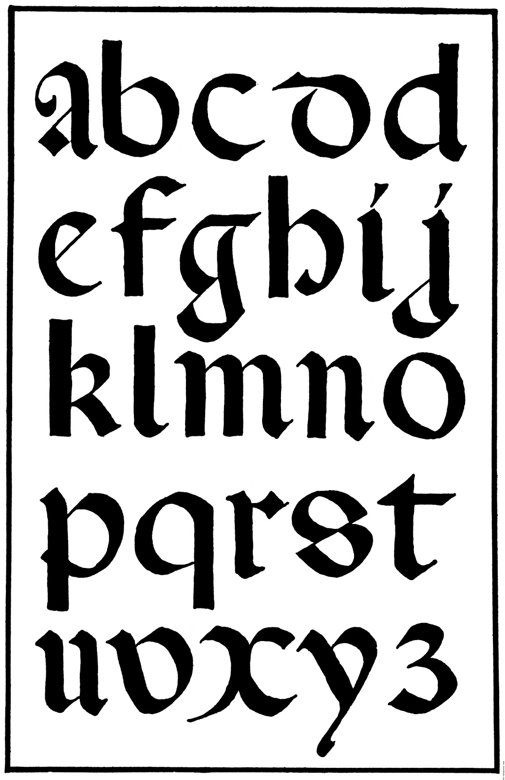
Our story begins in the 12th century, amidst the soaring cathedrals and burgeoning intellectualism of the High Middle Ages. As literacy rates slowly rose, so did the demand for written texts. Monasteries, the epicenters of knowledge production, employed scribes who diligently copied manuscripts by hand. It's within these scriptoria that Gothic lettering, initially known as "textualis" or "textura" script, first emerged.
This new lettering style was a far cry from its predecessor, the Carolingian minuscule, known for its rounded and legible forms. Gothic lettering, in contrast, was characterized by its angular, condensed letterforms, with strokes that often met at sharp points. This distinctive style served a practical purpose: maximizing the amount of text that could fit on expensive parchment while still remaining legible. However, it also possessed an undeniable aesthetic appeal, reflecting the architectural grandeur and spiritual fervor of the Gothic era.
Over the centuries, Gothic lettering underwent numerous transformations, giving rise to regional variations and stylistic flourishes. From the highly ornate "Fraktur" script popularized in Germany to the more rounded and legible "Rotunda" script favored in Italy, Gothic lettering evolved to reflect the cultural nuances and artistic sensibilities of different regions.
Advantages and Disadvantages of Using Gothic Lettering Fonts
| Advantages | Disadvantages |
|---|---|
|
|
While the invention of the printing press in the 15th century marked a turning point in the history of written communication, Gothic lettering continued to hold sway in certain contexts. It graced official documents, religious texts, and even early printed books, preserving its association with tradition, authority, and cultural heritage. In Germany, Fraktur script remained the dominant typeface for centuries, even influencing the design of some early typewriters.
Today, Gothic lettering might not be as ubiquitous as it once was, but its allure remains as potent as ever. Graphic designers, typographers, and artists continue to draw inspiration from its rich history and distinctive aesthetics, incorporating it into everything from logos and branding materials to posters, book covers, and tattoos.
Whether used to evoke a sense of medieval mystery, add a touch of vintage charm, or simply make a bold visual statement, Gothic lettering continues to captivate and intrigue viewers centuries after its emergence. So, the next time you encounter these striking letterforms, take a moment to appreciate the long and fascinating history they embody—a testament to the enduring power of typography and its ability to transport us through time and culture.
The allure of anime bad boys exploring the appeal of rebellious charm
Level up your discord game the ultimate guide to downloading memes
Ooze vape pen blinking purple


