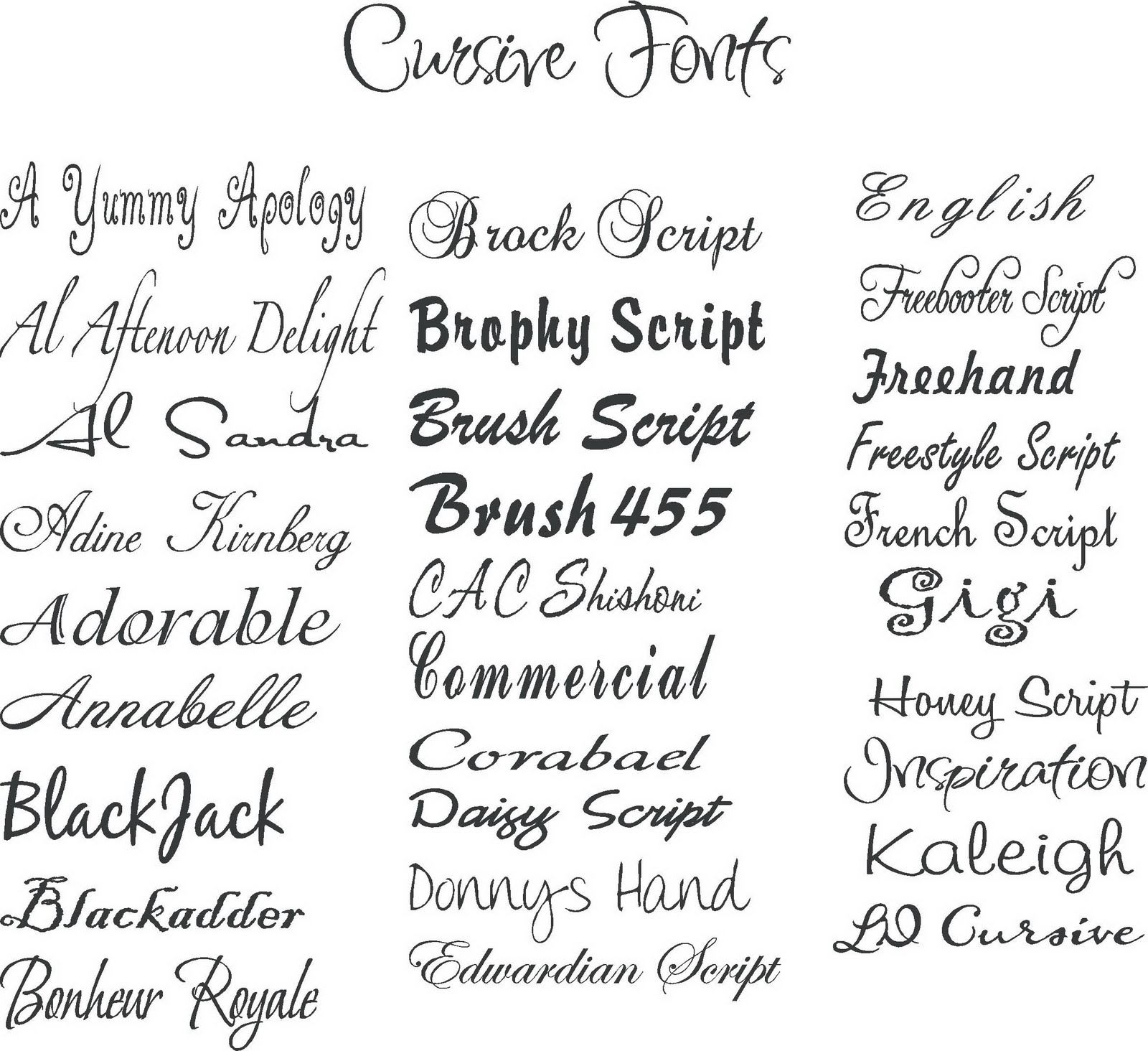
Unlocking the Power of Typography: A Guide to Font Style Names
Have you ever noticed how the look and feel of text can dramatically impact a message? The magic behind this lies in the art of typography, and at its core are the diverse and expressive font styles. From the elegant curves of a script typeface to the bold impact of a sans-serif, each font style carries its own personality and purpose. This comprehensive guide will delve into the world of font style names, exploring their origins, significance, and practical applications.
Choosing the right font style is crucial for effective communication. A poorly chosen typeface can confuse the reader, diminish the message's impact, or even misrepresent the brand's identity. Conversely, a well-selected font style can enhance readability, create visual harmony, and evoke specific emotions. This journey into the realm of typography will equip you with the knowledge to navigate the vast landscape of font style names and harness their power to elevate your designs and content.
The history of font styles is intertwined with the evolution of written language itself. From the earliest handwritten scripts to the advent of the printing press and the digital revolution, typefaces have constantly evolved, reflecting the changing times and technological advancements. Understanding this historical context can help us appreciate the nuances and artistry behind each font style.
Different typographic classifications categorize font styles based on their shared characteristics. Serif fonts, characterized by small decorative strokes at the ends of letterforms, evoke a sense of tradition and formality. Sans-serif fonts, lacking these serifs, project a modern and clean aesthetic. Script fonts mimic handwriting, adding a touch of elegance or playfulness. Display fonts, designed for larger sizes, are often used for headlines and titles, commanding attention with their unique and expressive designs. Knowing these distinctions is essential for selecting appropriate font styles for different purposes.
Beyond the basic classifications, exploring the nuances within each category unveils a rich tapestry of individual font styles. Consider the subtle differences between a geometric sans-serif like Futura and a humanist sans-serif like Gill Sans. The former, with its precise and uniform shapes, conveys a sense of modernity and efficiency, while the latter, with its more organic and calligraphic influences, feels warmer and more approachable. Understanding these subtle distinctions allows for fine-tuned control over the visual message.
One key benefit of using varied font styles is enhancing readability. Pairing a highly readable serif font for body text with a contrasting sans-serif for headings creates a clear visual hierarchy, making it easier for readers to scan and digest information. For example, using Times New Roman for body text and Arial for headings is a common and effective practice.
Another advantage is reinforcing brand identity. A company's chosen font styles become an integral part of its visual language, contributing to brand recognition and conveying its personality. Think of the distinctive script font used by Coca-Cola or the bold, geometric typeface associated with tech companies like Google. These font choices reinforce their respective brand identities.
Lastly, different font styles can evoke specific emotions and set the tone for a piece of content. A delicate script font can add a touch of romance or elegance to a wedding invitation, while a bold, condensed typeface might be used for a poster promoting an action movie. By carefully selecting font styles, designers can influence the viewer's emotional response.
Advantages and Disadvantages of Different Font Styles
| Font Style | Advantages | Disadvantages |
|---|---|---|
| Serif | Readability in long texts, traditional, formal | Can appear outdated in some contexts |
| Sans-serif | Modern, clean, versatile | Can lack personality in some cases |
| Script | Elegant, decorative, expressive | Can be difficult to read in small sizes or long texts |
Frequently Asked Questions about Font Style Names:
1. What is the difference between a font and a typeface? (A typeface is a family of fonts, while a font is a specific weight, style, and size within that family.)
2. Where can I find free fonts? (Websites like Google Fonts and DaFont offer a wide selection of free fonts.)
3. How do I choose the right font for my website? (Consider your target audience, brand personality, and the overall tone of your content.)
4. What are some common font pairing mistakes? (Pairing fonts that are too similar or too different can clash and create visual dissonance.)
5. How many fonts should I use in one design? (It's generally recommended to stick to a maximum of two or three fonts.)
6. What is kerning? (Kerning refers to the adjustment of space between individual letters.)
7. What is leading? (Leading refers to the space between lines of text.)
8. What is tracking? (Tracking refers to the overall letter spacing in a block of text.)
In conclusion, understanding and effectively utilizing different font style names is essential for anyone working with text, whether you're a designer, writer, or marketer. By appreciating the nuances of each typeface, from the historical context to the emotional impact, you can elevate your communication and create visually compelling content that resonates with your audience. From enhancing readability to reinforcing brand identity, the power of typography is undeniable. Take the time to explore the vast world of font styles, experiment with different combinations, and discover the transformative impact they can have on your work. The journey through the world of typography is an ongoing one, full of discovery and creative possibilities. Embrace the power of font styles and unlock a new level of visual communication.
Motivational quotes from men of honor finding inspiration in words
Conquering the empty tank mastering the fuel gauge sending unit test
The allure of white nail designs a canvas for creativity


