The Perfect Typeface: Choosing the Best Font for a Wanted Poster
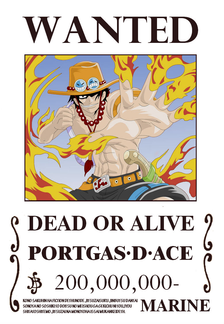
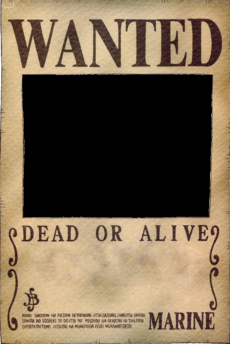
Imagine a dusty saloon in the Wild West. A tattered wanted poster hangs precariously, its message clear: "WANTED: Dead or Alive." What font screams outlaw more than that bold, serifed typeface? The right font choice can make or break a wanted poster, transforming it from a simple notice to a powerful statement.
Choosing the best font for a wanted poster is more than just an aesthetic decision; it's a strategic one. The typeface you select needs to communicate the gravity of the situation, capture attention, and be easily legible from a distance. Whether you're designing a poster for a school play, a community event, or a playful inside joke, the font is key to conveying the right tone and message.
From classic Western-inspired designs to modern minimalist approaches, the world of typography offers a vast array of options. This article delves into the history and psychology of wanted poster fonts, providing you with a comprehensive guide to selecting the perfect typeface for your project. We'll explore the nuances of different font families, discuss legibility and impact, and offer practical tips for creating a visually arresting and effective wanted poster.
Historically, wanted posters relied on bold, impactful fonts. Think of the iconic "serif" typefaces often seen in Western films. These fonts, with their small decorative strokes at the ends of letterforms, evoke a sense of history and authority. The use of these fonts often implied a serious offense and a significant reward for capture. Today, however, the options are far more diverse, allowing for a wider range of tones and styles.
Understanding the psychological impact of fonts is crucial. A playful, rounded font might be appropriate for a missing pet poster, while a strong, blocky font might be better suited for a more serious announcement. The key is to align the font choice with the overall message and intended audience. What feeling are you trying to evoke? A sense of urgency? A touch of humor? The right font can help you achieve the desired effect.
One of the benefits of selecting an appropriate font is enhanced readability. Imagine a wanted poster with an overly ornate or stylized font—it might look interesting up close, but from a distance, it becomes illegible, defeating its entire purpose. A clear, easily readable font ensures that the crucial information on the poster, such as the name, description, and reward, is quickly and easily understood.
Another benefit is establishing the right tone. The font choice contributes significantly to the overall mood and message of the poster. A playful script font can create a lighthearted feel, while a bold, condensed font can convey a sense of seriousness and urgency. The font acts as a visual cue, setting the stage for how the information on the poster is received.
Finally, a well-chosen font adds to the visual appeal and memorability of the poster. A distinctive typeface can make the poster stand out, increasing the chances of it being noticed and remembered. This is particularly important in a world saturated with visual information, where capturing attention is paramount.
Advantages and Disadvantages of Different Font Styles
| Font Style | Advantages | Disadvantages |
|---|---|---|
| Serif (e.g., Times New Roman) | Classic, authoritative, readable in large blocks of text | Can appear dated or overly formal in some contexts |
| Sans Serif (e.g., Arial, Helvetica) | Clean, modern, versatile | Can lack personality or impact in headlines |
| Slab Serif (e.g., Rockwell, Courier) | Bold, impactful, good for headlines | Can be less readable in smaller sizes |
| Script (e.g., Brush Script, Pacifico) | Elegant, playful, good for informal posters | Can be difficult to read at smaller sizes or from a distance |
| Decorative (e.g., Playfair Display, Lobster) | Unique, eye-catching, adds personality | Can be overly stylized and difficult to read |
Frequently Asked Questions:
Q: What are some good fonts for a Wild West wanted poster?
A: Try fonts like Rockwell, Playbill, or a distressed version of a classic serif font.
Q: What about for a missing pet poster?
A: A friendly, rounded font like Comic Sans or a handwritten-style font might be appropriate.
Q: How can I make my font look distressed?
A: Many graphic design programs offer tools to add distress effects to fonts.
Q: Should I use all caps for my wanted poster?
A: While all caps can grab attention, overuse can make it harder to read.
Q: What size font should I use?
A: Consider the viewing distance. Larger posters need larger fonts.
Q: Can I mix and match fonts?
A: Yes, but use caution. Too many fonts can look cluttered.
Q: Are there any free fonts I can use?
A: Yes, websites like Google Fonts offer a wide selection of free fonts.
Q: How do I choose the right font color?
A: Consider contrast. The font should be easily readable against the background.
In conclusion, the best font for a wanted poster is a critical element in its effectiveness. From the historic impact of bold serifs in Wild West posters to the modern versatility of sans serif fonts, the right typeface can capture attention, convey the right message, and ensure readability. By considering the psychological impact of fonts, understanding the advantages and disadvantages of different font styles, and exploring the numerous options available, you can create a wanted poster that is not only visually appealing but also effectively communicates its message. Take the time to experiment, explore, and choose a font that truly captures the essence of your wanted poster's purpose. This seemingly small detail can make a world of difference in how your message is received and remembered.
Blake livelys it ends with us interview a deep dive
Thumb pain dolor en el dedo pulgar causes treatments and relief
The art of the selfie crafting compelling instagram story captions


:max_bytes(150000):strip_icc()/GettyImages-165931367-5c06d207c9e77c0001ee02ef.jpg)

