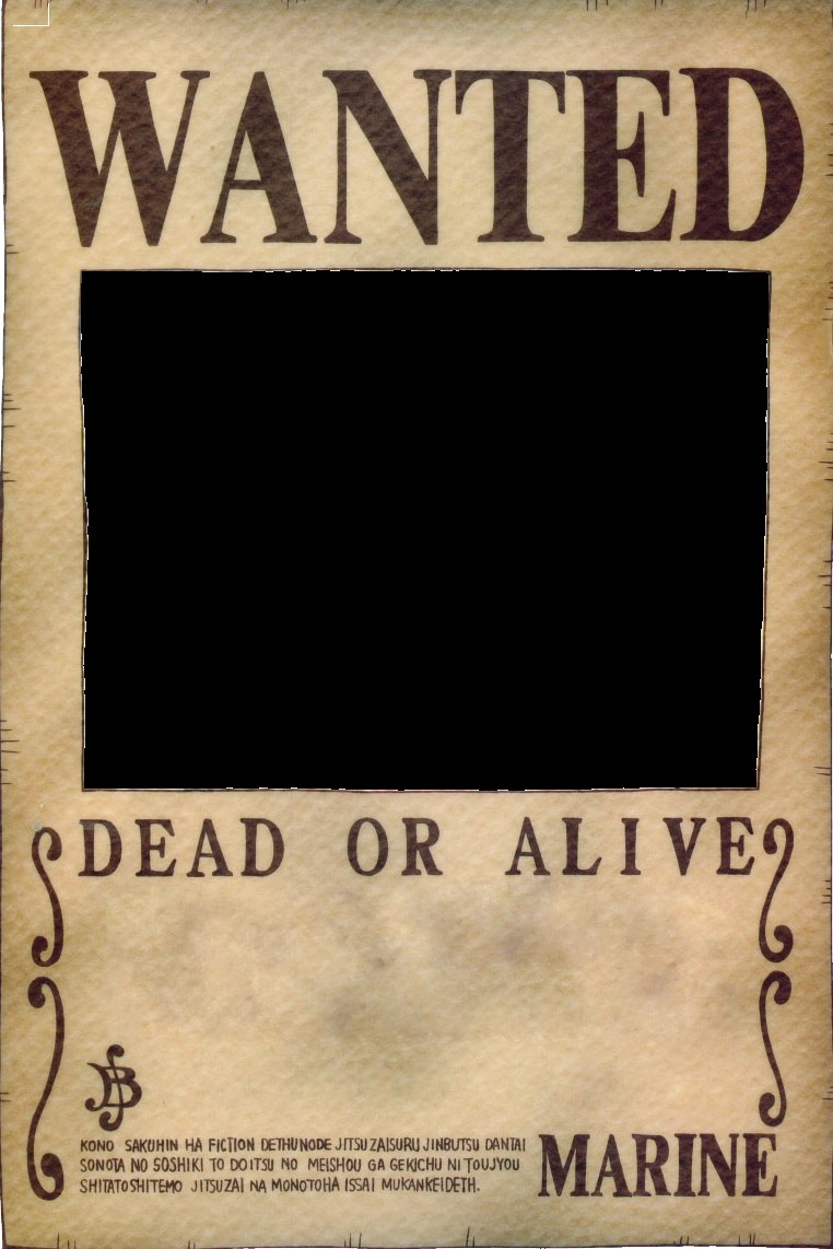
Round 'Em Up! The Ultimate Guide to Wanted Poster Fonts
Ever wanted to design a wanted poster that truly captures the spirit of the Wild West or the intrigue of a modern-day mystery? The key lies in selecting the right typeface. The perfect wanted poster font can transform a simple notice into a captivating piece of graphic design, evoking a sense of drama, urgency, or even a touch of humor. This comprehensive guide will delve into the world of wanted poster typography, exploring the history, best practices, and everything you need to create the ultimate attention-grabbing design.
Wanted posters hold a unique place in popular culture. They symbolize rebellion, justice, and the pursuit of outlaws. Their distinctive visual style, largely defined by typography, has become iconic. From classic Western films to contemporary graphic design, wanted poster aesthetics remain a powerful tool for storytelling and visual communication.
Historically, wanted posters were primarily a tool for law enforcement to disseminate information about criminals on the run. The fonts used were often chosen for their legibility and impact, ensuring the message could be quickly understood at a glance. Common choices included bold serif and slab serif typefaces, reflecting the printing technology available at the time. These early fonts laid the groundwork for the stylistic conventions we associate with wanted posters today.
Choosing the right font is crucial for conveying the desired tone and authenticity of your wanted poster. A poorly chosen typeface can undermine the overall effect, making the design look amateurish or unconvincing. Therefore, understanding the historical context and the visual language of wanted posters is essential for creating impactful designs.
The main issues surrounding wanted poster fonts relate to achieving the right balance between legibility and stylistic authenticity. While a highly decorative font might look appealing, it can become difficult to read, especially at smaller sizes. Similarly, a modern font can clash with the historical context of a traditional wanted poster. The goal is to select a typeface that is both visually engaging and easily decipherable, effectively communicating the information while capturing the desired aesthetic.
Some popular wanted poster font choices include Playbill, Rockwell, Rosewood Std, and other slab serif or Tuscan style typefaces. These fonts evoke the ruggedness and boldness associated with the Wild West era.
One benefit of using an appropriate wanted poster font is enhanced visual appeal. The right font can instantly grab the reader's attention and create a strong visual impression.
Another advantage is improved readability. While maintaining a stylized look, choosing a clear and legible font ensures the information on the poster is easily understood.
Finally, using the right font establishes historical accuracy and thematic consistency. This adds to the overall authenticity and impact of the design, particularly for projects aiming for a specific historical period.
Advantages and Disadvantages of Specific Wanted Poster Fonts
| Font | Advantages | Disadvantages |
|---|---|---|
| Slab Serif (e.g., Rockwell) | Bold, impactful, historically accurate | Can be too heavy for large amounts of text |
| Tuscan (e.g., Rosewood Std) | Ornate, decorative, eye-catching | Can be difficult to read at small sizes |
| Sans Serif (e.g., Impact) | Modern, clean, versatile | Can feel anachronistic in a historical context |
Five best practices for implementing wanted poster fonts include:
1. Consider the context: Choose a font that aligns with the overall theme and historical period.
2. Prioritize legibility: Ensure the font is easy to read, even at smaller sizes.
3. Experiment with different styles: Try various fonts to find the best fit for your design.
4. Use font effects sparingly: Avoid overusing effects like drop shadows or outlines, which can detract from readability.
5. Test your design: View your poster from different distances to ensure the font remains legible.
Frequently Asked Questions:
1. Where can I find free wanted poster fonts? Many websites offer free fonts for download.
2. What software can I use to create a wanted poster? Graphic design software like Adobe Photoshop or free alternatives like Canva are suitable.
3. What information should I include on a wanted poster? Typically, a name, description, and alleged crime are included.
4. Can I use wanted poster fonts for commercial projects? Check the font's license agreement.
5. What are some alternative font styles for wanted posters? Victorian, Western, and vintage fonts are good options.
6. How can I make my wanted poster look aged? Use textures and filters in your design software.
7. What size should my wanted poster be? The size depends on the intended use.
8. Are there copyright restrictions on using images in wanted posters? Yes, ensure any images you use are copyright-free or that you have the necessary permissions.
Tips and tricks: Experiment with distressed textures and vintage paper backgrounds to enhance the authenticity of your wanted poster. Consider adding bullet holes or torn edges for a more dramatic effect.
In conclusion, selecting the perfect wanted poster font is crucial for creating a visually arresting and effective design. From the classic slab serifs of the Wild West to more modern interpretations, the right typeface can convey a sense of history, drama, or even humor. By considering the historical context, prioritizing legibility, and following best practices, you can create a wanted poster that captures attention and effectively communicates your message. Explore different options, experiment with various styles, and remember that the ultimate goal is to find a font that not only looks appealing but also reinforces the overall theme and message of your design. Take the time to carefully consider your options, and you'll be well on your way to crafting a truly captivating wanted poster. Remember to always check licensing agreements before using any font for commercial purposes. Now go forth and create some legendary wanted posters!
Finding comfort in oracion por los fieles difuntos a guide to praying for the dead
Exploring santa maria rio grande do sul does it have an airport
Why you keep grabbing the wrong socket comparing metric and sae socket sizes


