Posters vs. Infographics: What's the Difference and Which One Do You Need?
In the world of visual communication, getting your message across quickly and effectively is key. Two popular tools that often come up are posters and infographics. While they both rely heavily on visuals, their purposes and approaches differ. Understanding these differences is crucial for choosing the right tool to communicate your message with maximum impact.
Imagine you're walking down a busy street, and a brightly colored design catches your eye. It could be a poster promoting an upcoming event or an infographic breaking down complex data on climate change. Both aim to capture your attention, but they do so with different goals in mind.
A poster's primary function is to grab attention and create buzz. It's like a visual shout, often used for advertising, promoting events, or raising awareness for a cause. Think of movie posters with bold typography and striking imagery designed to entice you to watch the film.
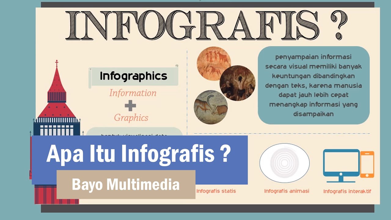
On the other hand, an infographic aims to educate and inform. It takes complex information and presents it in a visually appealing and easily digestible way. Imagine trying to explain the history of the internet solely through text. Now, picture an infographic with timelines, icons, and charts – suddenly, the information becomes clearer and more engaging.
The choice between a poster and an infographic depends entirely on your objective. Do you want to generate excitement and buzz around a topic, or provide a detailed explanation of a complex subject? Once you define your goal, you can select the appropriate tool and start crafting your message.
Understanding the Key Differences
While both posters and infographics use visuals, understanding their key differences will help you leverage their strengths:
| Feature | Poster | Infographic |
|---|---|---|
| Primary Goal | Grab attention, promote, create buzz | Educate, inform, simplify complex data |
| Content Approach | Concise, attention-grabbing headlines, limited text | Detailed, data-driven, uses visuals to explain concepts |
| Visual Style | Bold, eye-catching, often uses photography or illustration | Clean, organized, utilizes charts, graphs, and icons |
| Call to Action | Clear and concise (e.g., "Attend Now!", "Learn More") | Subtle, encourages understanding and further exploration |
When to Use Posters
Posters are your go-to choice when you need to:
- Promote an event or product launch.
- Raise awareness for a cause or campaign.
- Decorate a space with a visually appealing message.
- Capture attention in a busy environment.
- Create a memorable visual representation of a brand or message.
When to Use Infographics
Infographics are ideal for:
- Explaining complex processes or systems.
- Presenting data analysis and research findings.
- Simplifying difficult concepts for better understanding.
- Educating your audience on a specific topic.
- Making data-heavy content more engaging and shareable.
Choosing the Right Tool for Your Needs
The key to successful visual communication lies in choosing the right tool for the job. By understanding the strengths of both posters and infographics, you can create compelling visuals that effectively communicate your message and resonate with your audience.
Express yourself exploring the world of sad boyz fondo de pantalla
Unlocking the secrets of cat paw bone structure
Thomas neff green lawn obituary


