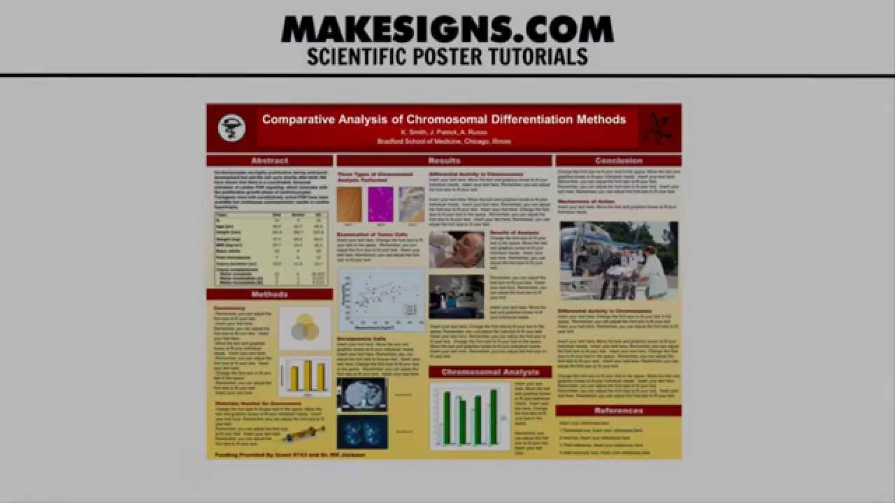
Nail Your Presentation: Mastering Font Size for Research Success
Imagine presenting your groundbreaking research, only to have the audience squinting at illegible slides. Or, worse, presenting with text so large it feels childish. The right font size for a research presentation can make or break your delivery, impacting audience comprehension and your overall credibility. This comprehensive guide dives deep into the nuances of presentation font sizes, ensuring your hard work shines.
Selecting an appropriate presentation font size is more than just picking a number. It's about creating a visual harmony that supports your content, engages your audience, and reinforces your professionalism. A well-chosen typeface size allows your data and insights to take center stage, making your presentation accessible and engaging for everyone in the room.
While there isn't a magic number universally applicable to all presentations, there are proven principles and best practices to guide your choices. Factors like room size, audience demographics, and presentation medium all play crucial roles in determining the optimal font size. This guide will equip you with the knowledge to navigate these considerations and select font sizes that enhance your presentation's impact.
From understanding the historical context of typography in presentations to tackling modern challenges like varying screen resolutions, this resource provides a complete overview. We'll explore the importance of readability, accessibility, and the subtle psychological impact of different font sizes on audience perception.
Beyond practical advice on selecting appropriate sizes, we'll delve into the common pitfalls presenters encounter and offer effective solutions. This guide serves as your comprehensive toolkit for maximizing the impact of your research presentations through strategic font size selection.
Historically, presentations relied heavily on printed materials or overhead projectors, which often necessitated larger font sizes for visibility. With the advent of digital projectors and high-resolution screens, the landscape shifted, allowing for greater flexibility. However, the core principle of readability remained paramount.
Choosing the right text dimensions is crucial for clear communication. A font size too small forces the audience to strain, hindering comprehension and engagement. Conversely, excessively large text can appear unprofessional and detract from the content's seriousness. Finding the right balance ensures your message is conveyed effectively.
One benefit of using appropriate text scaling is enhanced readability. A clear, easily readable presentation allows the audience to focus on your research findings rather than deciphering the text. For instance, using a 32-point font for headings and a 24-point font for body text in a large conference hall ensures optimal visibility.
Another advantage is improved audience engagement. When the audience can easily read your slides, they are more likely to stay focused and absorb your message. Think about a presentation where the text is so small that the audience loses interest. A well-chosen font size contributes significantly to a captivated audience.
Lastly, proper font size selection contributes to a professional image. A well-designed presentation with appropriate font sizes reflects positively on your credibility and professionalism. A haphazard approach to font size, on the other hand, can create an impression of carelessness.
Before your next presentation, create a checklist: Consider the venue size, screen dimensions, and audience demographics. Choose a clear, professional font. Test your slides from the back of the room to ensure readability. These simple steps can significantly impact your presentation's success.
Advantages and Disadvantages of Different Font Sizes
| Font Size | Advantages | Disadvantages |
|---|---|---|
| Large (32+ pt) | High visibility, good for titles | Can appear simplistic, limits text per slide |
| Medium (24-32 pt) | Good balance of readability and space | May be too small for large venues |
| Small (18-24 pt) | Allows for more text per slide | Can be difficult to read, especially from a distance |
A common challenge is inconsistent font sizes across different slides. The solution is to establish a style guide with predefined sizes for headings, body text, and other elements. Another challenge is choosing appropriate font sizes for different media. The solution is to adjust text dimensions based on screen size and resolution, optimizing for each platform.
In conclusion, the font size in your research presentation is a seemingly small detail that wields significant power. By understanding the principles of readability, accessibility, and visual appeal, you can transform your presentations into truly engaging experiences. Take the time to plan your font sizes strategically, considering your audience and venue, and watch your research impact soar. This seemingly small detail can make or break your ability to communicate effectively, connect with your audience, and ultimately achieve your presentation goals. Don't underestimate the power of a well-chosen font size – it’s an investment in the success of your research.
Unveiling bucks county pa criminal records a comprehensive guide
Unlocking guadeloupean creole your online dictionary guide
Level up your laptop vibe the ultimate guide to aesthetic plant backgrounds


