Mastering APA 7 Font and Spacing: A Comprehensive Guide
Imagine your academic paper, a beacon of meticulous research and insightful analysis, being dimmed by inconsistent formatting. APA 7th edition guidelines for font and spacing, often seen as minor details, play a crucial role in ensuring your work is presented clearly, professionally, and with academic integrity. This guide dives deep into the intricacies of APA 7 font and spacing, offering practical advice and clear examples to help you navigate these requirements with confidence.
Typography and spacing are more than just aesthetic choices in academic writing. They contribute significantly to readability, allowing your arguments to flow smoothly and ensuring your readers can easily process your complex ideas. Ignoring these seemingly small details can create a jarring reading experience, detracting from the impact of your hard work. By mastering the APA 7 font and spacing conventions, you communicate a commitment to academic rigor and demonstrate respect for your readers.
The American Psychological Association (APA) style prioritizes clarity and consistency. Its 7th edition emphasizes these values through specific guidelines for font selection, spacing between lines and paragraphs, margins, and indentation. These rules, while detailed, aim to create a standardized presentation that enhances readability and allows the reader to focus on the content, rather than the formatting.
Historically, consistent formatting has been a cornerstone of academic publishing. Standardized styles like APA emerged to simplify the editorial process and ensure a uniform presentation across scholarly works. APA’s evolution through various editions reflects the ongoing effort to refine and adapt these guidelines in response to changes in technology and publishing practices.
While seemingly straightforward, applying APA 7 font and spacing can be challenging. Common issues include choosing incorrect fonts, inconsistent spacing between lines or paragraphs, improper indentation, and difficulty formatting tables and figures. This guide aims to address these challenges, providing practical solutions and helpful tips to ensure your documents conform perfectly to APA 7 standards.
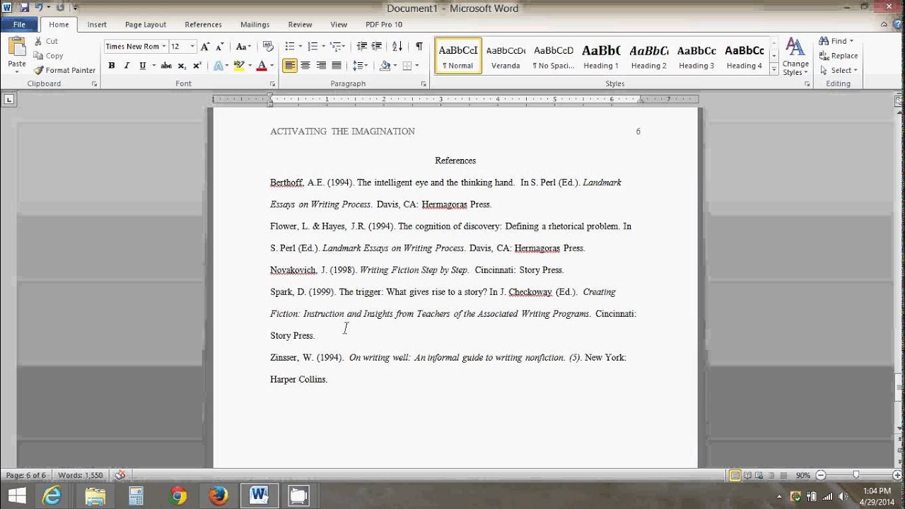
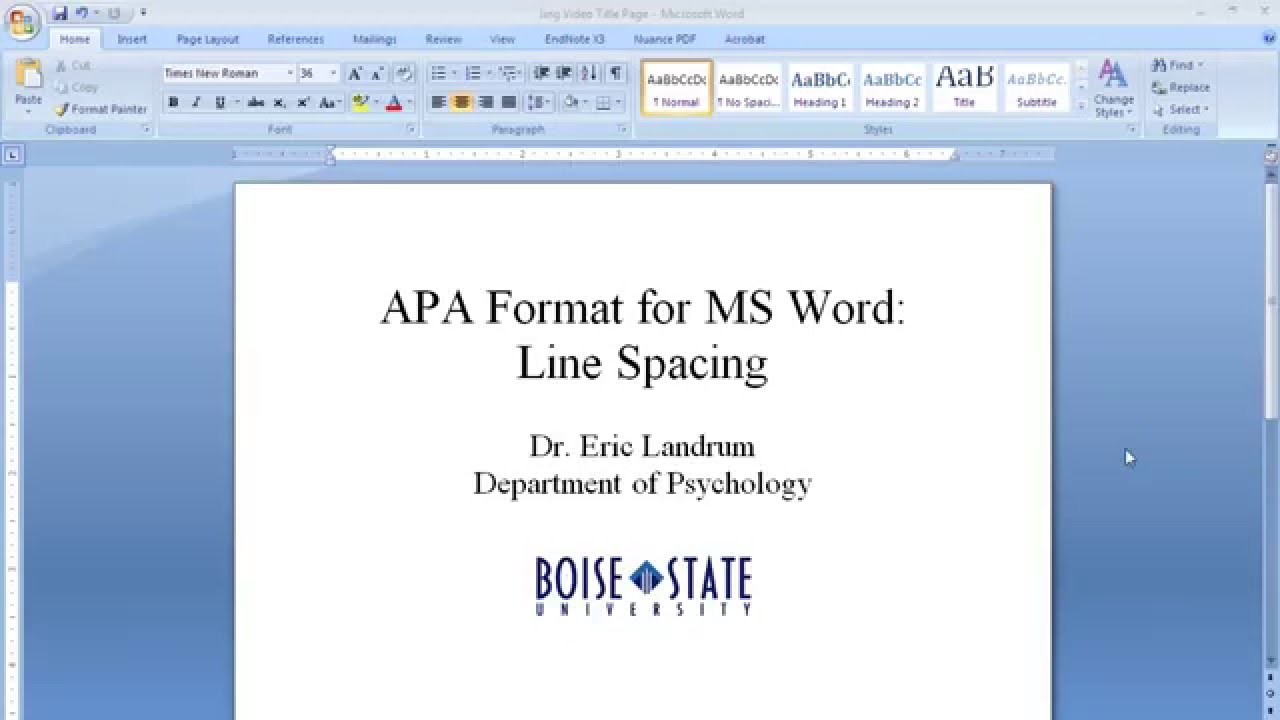
APA 7 recommends using easily readable fonts like Times New Roman (12pt), Calibri (11pt), Arial (11pt), Georgia (11pt), or Lucida Sans Unicode (10pt). Consistent double-spacing is required throughout the document, with no extra space between paragraphs. Margins should be one inch on all sides. First lines of paragraphs are indented half an inch.
Three key benefits of following APA 7 font and spacing are enhanced readability, professional presentation, and improved credibility. Readability improves because standardized formatting makes the text easier to process visually. Professional presentation demonstrates attention to detail and adherence to academic standards. This enhances credibility, signaling a serious approach to research and writing.
To ensure proper implementation, use your word processor's style features to automate formatting. Create a template with pre-set APA styles for headings, paragraphs, and citations. Regularly consult the APA 7 manual for clarification and updates.
Advantages and Disadvantages of Strict Adherence to APA 7 Font and Spacing
| Advantages | Disadvantages |
|---|---|
| Enhanced readability | Can feel restrictive to creative expression |
| Professional presentation | Requires meticulous attention to detail |
| Improved credibility | Can be time-consuming to implement perfectly |
Best Practices: 1. Utilize your word processor's styles. 2. Double-check everything. 3. Use the official APA 7 manual. 4. Seek feedback from others. 5. Use online APA checkers.
Real Examples: Look at published articles in APA format. Analyze their font and spacing. Practice replicating the formatting in your own documents. Study sample papers available online. Consult with your university's writing center.
Challenges and Solutions: Inconsistent spacing – Solution: Use paragraph styles. Incorrect font – Solution: Set default font in your word processor. Trouble with indents – Solution: Use the tab key or ruler. Formatting tables – Solution: Consult the APA manual. Formatting figures – Solution: Consult the APA manual.
FAQ: 1. What font size is recommended? (12pt Times New Roman). 2. Is double-spacing required? (Yes). 3. What are the margin requirements? (One inch). 4. Should I add extra space between paragraphs? (No). 5. How do I indent paragraphs? (Half an inch). 6. What about font for headings? (Consult the APA manual). 7. Are there exceptions to these rules? (Consult the APA manual). 8. Where can I find more information? (APA Style website).
Tips and Tricks: Create a template for future papers. Use the “show/hide” function to see hidden formatting characters. Regularly review the APA guidelines.
Mastering APA 7 font and spacing is essential for presenting your academic work professionally and effectively. While the specific guidelines may seem intricate at first, understanding the underlying principles of clarity and consistency simplifies the process. By adhering to these conventions, you enhance the readability of your work, allowing your ideas to shine through and demonstrating your commitment to academic rigor. Take the time to familiarize yourself with the nuances of APA 7 formatting. The effort you invest will be reflected in the polished presentation of your work, ultimately contributing to your success as a scholar and researcher. Start implementing these practices today, and watch your academic writing transform into clear, consistent, and compelling presentations of your research.
Calendario con las semanas a more intentional approach to time
Ocean county jail toms river nj mugshots
The whimsical allure of gambar mobil mobilan kartun


