Decoding MS Word Font Sizes: A Comprehensive Guide
Have you ever stopped mid-sentence, staring at the font size dropdown in Microsoft Word, and wondered, "What exactly *is* a point anyway?" It's a question many of us have pondered, often lost in the flurry of formatting and deadlines. This seemingly small detail, the unit of font size, plays a surprisingly significant role in the readability, aesthetic appeal, and overall impact of our documents.
In the world of digital typography, the standard unit for measuring font size in Microsoft Word, and indeed most other applications, is the "point." This seemingly simple unit carries a rich history and impacts how we perceive and interact with written content. Understanding how points work can elevate your document design from amateur to polished and professional.
The point system originated in traditional print typography, where physical type was measured in points. In the digital realm, a point is defined as approximately 1/72 of an inch. This means that a 72-point font would theoretically be about one inch tall. However, the actual height of a character can vary slightly depending on the specific font and its design.
So, why is understanding MS Word's font size measurement important? Consider the implications: A tiny font size can render a document virtually illegible, causing frustration and eye strain. Conversely, an excessively large font can appear unprofessional and childish. Choosing the appropriate font size ensures clarity, improves readability, and enhances the overall visual appeal of your document, ultimately communicating your message effectively.
Navigating the world of font sizes in MS Word can sometimes feel like a guessing game. However, understanding the point system provides a foundation for making informed design decisions. From crafting impactful presentations to writing compelling reports, knowing how to control font size empowers you to create documents that are both visually appealing and easily digestible.
The history of the point system is intertwined with the evolution of printing. Originally, various point systems were used, leading to inconsistencies. Eventually, the DTP point (or PostScript point) became the standard, establishing the 1/72 inch measurement.
One common issue with font sizes arises when transferring documents between different software or operating systems. Slight variations in how points are interpreted can lead to unexpected changes in formatting. This highlights the importance of using standardized font sizes and previewing documents on different devices before finalizing them.
Choosing the right font size contributes to accessibility. Larger fonts accommodate readers with visual impairments, while appropriate sizes enhance readability for everyone.
Consistency in font size within a document improves its professional appearance. Using a standard size for body text and headings creates a cohesive and organized look.
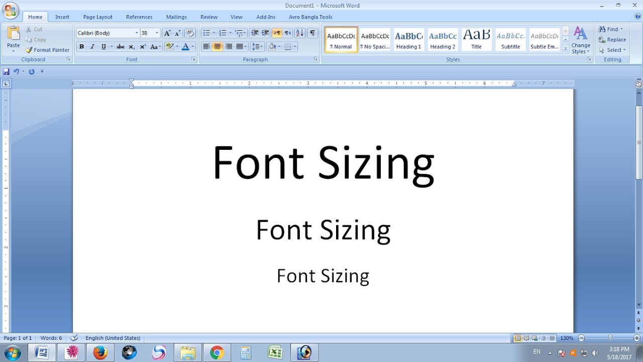
Effective use of font sizes aids in visual hierarchy. Larger headings grab attention, while smaller text provides supporting details, guiding the reader through the content.
Action Plan for Using Font Sizes Effectively:
1. Define Your Purpose: What kind of document are you creating? A formal report will likely require different font sizes than a casual email.
2. Consider Your Audience: Who will be reading your document? Older audiences might benefit from larger font sizes.
3. Choose a Base Font Size: A common practice is to use 11 or 12-point font for body text.
Advantages and Disadvantages of Point System
| Advantages | Disadvantages |
|---|---|
| Standard unit for font size | Can vary slightly between systems |
| Precise control over text size | May require adjustments for accessibility |
Best Practices:
1. Maintain Consistency: Use consistent font sizes for headings, body text, and other elements.
2. Prioritize Readability: Avoid extremely small or large font sizes.
3. Use Hierarchy: Employ different font sizes to create visual hierarchy.
4. Test Across Platforms: Preview your document on different devices to ensure consistency.
5. Consider Accessibility: Offer options for users to adjust font size if needed.
Frequently Asked Questions:
1. What is the default font size in MS Word? Typically, it's 11 or 12 points, depending on the template.
2. Can I change the unit of measurement for font size? While you primarily interact with points, other units can be used through advanced settings.
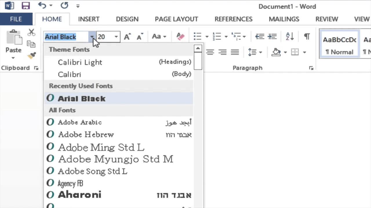
3. How do I increase or decrease font size? Use the font size dropdown menu or keyboard shortcuts.
4. What is the relationship between font size and line spacing? Larger font sizes generally require more line spacing for readability.
5. What is the best font size for printing? It depends on the document and the printer, but 11 or 12 points are common choices.
6. How do I choose the right font size for headings? Headings should be larger than body text, but not excessively so.
7. Can I use different font sizes within the same paragraph? Yes, but use it sparingly for emphasis or special formatting.
8. What are some common font size mistakes to avoid? Using inconsistent sizes, extremely small or large fonts, and neglecting accessibility are common pitfalls.
Tips and Tricks: Use the zoom feature to preview your document at different sizes. Experiment with different font sizes to find what works best for your content.
Understanding the unit of font size in Microsoft Word, the point, is a crucial skill for anyone working with digital documents. From enhancing readability to ensuring accessibility and creating visually appealing layouts, mastering font size control empowers you to communicate effectively and professionally. By following the best practices outlined above and understanding the nuances of the point system, you can elevate the quality and impact of your written work. Take the time to experiment with different font sizes and observe their effects on your documents. You'll quickly discover how this seemingly small detail can make a big difference. Choosing the right font size isn't just about aesthetics; it's about ensuring your message is clear, accessible, and leaves a lasting impression. So, the next time you're formatting a document, remember the power of the point and use it wisely.
Conquering the crystal gems your steven universe watch through guide
Navigating toms river your guide to the municipal clerks office
Forearm color tiger tattoos for guys a roaring statement


