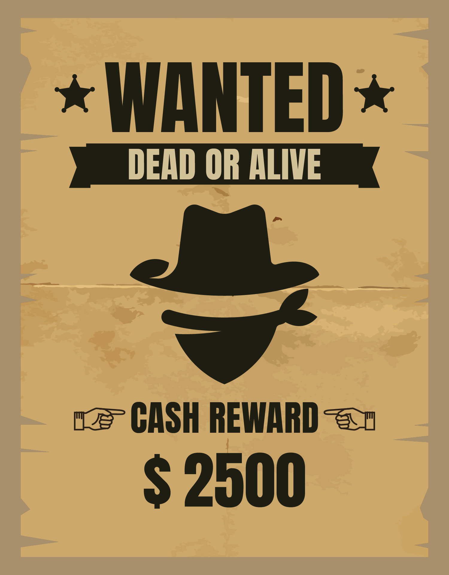
Deciphering the Wild West Typography: The Wanted Poster Font
Ever squint at a movie poster or a vintage-inspired design and wonder, "What *is* that font?" You know, the one that screams dusty saloons, high-noon showdowns, and maybe a slightly faded reward notice tacked to a wooden post? We're talking about the quintessential Wanted Poster font, and its bold, rugged presence evokes a whole era of frontier justice and tall tales.
The typeface that defines the Wild West aesthetic isn't a single, monolithic entity. Instead, it’s a family of related styles that share certain characteristics. Think bold, slab serifs, often with a condensed or extended width. These fonts convey a sense of urgency, authority, and just a touch of lawlessness, capturing the spirit of a time when communication needed to be clear, concise, and eye-catching – even across a dusty plains.
So, what's the story behind this iconic typography? Its roots lie in the wood type era of the 19th century, when printing presses relied on large, carved wooden blocks to create each letter. The resulting fonts were often thick, blocky, and impactful – perfect for posters needing to be read from a distance. This practical need for legibility birthed the aesthetic we associate with wanted posters today.
One commonly cited inspiration for the classic wanted poster look is the font known as "Playbill." With its strong serifs and condensed letterforms, Playbill evokes the dramatic flair of theatrical posters and captures the spirit of the Old West. Other similar typefaces often used to mimic the wanted poster style include "Rockwell," "Cooper Black," and various slab serif designs. Identifying the *exact* font used on a historical wanted poster can be tricky, as many were custom-made or variations of existing typefaces.
Understanding the history of wanted poster fonts allows us to appreciate their modern usage. They're no longer confined to capturing outlaws; instead, they bring a vintage, rugged feel to everything from movie titles to restaurant menus, adding a touch of nostalgic charm. But using these fonts effectively requires a delicate balance. Overuse can quickly tip into cliché, so consider them carefully and purposefully in your designs.
The importance of selecting the right "wanted poster" typeface extends beyond mere aesthetics. It's about capturing a specific mood and evoking a particular time and place. Imagine designing a poster for a Western-themed event. A delicate script font would feel out of place, while a bold, slab serif font instantly sets the scene.
One benefit of using wanted poster fonts is their inherent readability. The thick strokes and strong serifs ensure that text remains legible even at larger sizes or from a distance. This makes them ideal for headlines, titles, and short bursts of text that need to grab attention.
Another advantage is their versatility. While rooted in the Wild West aesthetic, these fonts can be surprisingly adaptable. Pair them with modern sans-serif fonts for a balanced contrast or use them sparingly for a subtle nod to vintage design.
Finally, these fonts are simply iconic. They carry a weight of history and cultural significance that instantly resonates with viewers. This makes them a powerful tool for communicating a sense of authenticity, adventure, and a touch of rebellion.
If you're aiming to recreate the authentic wanted poster look, start by exploring fonts like Playbill, Rockwell, and Cooper Black. Experiment with different weights, widths, and kerning (the spacing between letters) to find the perfect balance. Consider distressing the text for a more weathered, vintage effect.
Advantages and Disadvantages of Using Wanted Poster Fonts
| Advantages | Disadvantages |
|---|---|
| Readability | Can be overwhelming in large blocks of text |
| Versatility | Overuse can lead to cliché |
| Iconic and recognizable | Might not be suitable for all design contexts |
One real-world example is the poster for the Coen Brothers' film "True Grit." The title treatment uses a bold, condensed slab serif font that perfectly captures the film's Western setting and gritty tone.
Frequently Asked Questions:
1. What is the most common wanted poster font? Variations of slab serif fonts are frequently used.
2. Where can I find these fonts? Many are available online, both free and commercially.
3. Are these fonts suitable for body text? Generally, no, due to their boldness.
4. Can I use these fonts for modern designs? Yes, with careful consideration.
5. How can I create a distressed effect? Graphic design software often offers tools for this.
6. What are some alternative fonts? Consider other slab serifs or bolder sans-serifs.
7. Are there copyright issues to consider? Always check the licensing terms of any font you use.
8. How do I choose the right font for my project? Consider the overall tone and message you want to convey.
A tip for using wanted poster fonts: pair them with a contrasting, more neutral font for body text to create a balanced and readable design. Avoid overcrowding your design with too much bold text.
In conclusion, the "wanted poster font" encapsulates a rich history of visual communication. From its origins in the practical needs of 19th-century printing to its modern resurgence in design, this style of typography remains powerful and evocative. Understanding its history, nuances, and best practices allows us to wield its bold presence effectively, adding a touch of Wild West flair to our designs while respecting its historical significance. So, the next time you're looking to add a bit of gritty charm to your project, don't be afraid to embrace the power of the wanted poster font – just use it wisely. Explore the options, experiment with different combinations, and let the spirit of the Wild West inspire your creativity. By understanding its historical context and employing it thoughtfully, you can harness the power of this iconic typeface to create truly captivating designs.
Navigating second chances a look at cook county probation
Mastering tiktok on pc your guide to seamless text communication
Wheel enigma deciphering your rim size secrets


/GettyImages-165931367-5c06d207c9e77c0001ee02ef.jpg)


