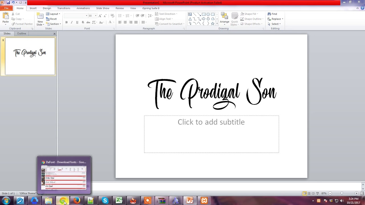
Death by Comic Sans? Choosing the Best Font for Your PowerPoint Presentation
Ever sat through a PowerPoint presentation where the font felt like a visual assault? Squinting at pixelated text, deciphering curlycues, or battling a distractingly bold typeface? Yeah, we’ve all been there. Choosing the right font for your PowerPoint presentation isn't just about aesthetics; it’s about effective communication. A well-chosen typeface can elevate your message, while a poor one can derail it entirely. So, how do you pick the best font for your ppt slides and avoid a typographical train wreck?
The ideal PowerPoint font walks a fine line between readability and visual appeal. It should be clear and legible, even from the back of a crowded room, while still complementing your presentation's overall style and tone. This balancing act can be tricky, especially with the vast array of font options available. But fear not, we're here to guide you through the typography jungle.
Historically, PowerPoint presentations have been plagued by default fonts that, while safe, often lack personality and impact. Arial and Calibri have served their time, but today's audiences expect more. They crave visuals that are engaging and memorable. The rise of accessible design has further emphasized the importance of font selection, ensuring that presentations are inclusive and accessible to all viewers, regardless of their visual abilities.
One of the main issues related to selecting appropriate typography for slideshows is the interplay between font size, weight, and color. A delicate balance is crucial. Too small, and your audience strains to read. Too large, and it feels like you’re shouting. The wrong color combination can make text disappear against the background or create a jarring, unpleasant effect. Finding the right mix is key to creating slides that are both visually appealing and easy to digest.
When discussing PowerPoint typography, it's crucial to understand a few key terms. "Serif" fonts, like Times New Roman, have small decorative strokes at the ends of each letter. These are generally considered more traditional and formal. "Sans-serif" fonts, like Arial and Helvetica, lack these strokes and often appear more modern and clean. "Font weight" refers to the thickness or thinness of the characters, ranging from light to bold. Choosing the right combination of these elements is essential for effective communication.
One of the biggest benefits of using an optimal PowerPoint font is improved readability. Clear, legible text allows your audience to easily absorb your message, without being distracted by trying to decipher the words on the screen. For example, using a clear sans-serif font like Helvetica for body text ensures maximum readability, especially in large presentation halls.
Another benefit is enhanced visual appeal. A well-chosen font can add a touch of personality and professionalism to your presentation. Using a slightly more stylized font like Garamond for headings can create a sense of sophistication, while a playful font like Comic Sans (used sparingly and appropriately!) can inject a touch of humor.
Finally, the right font can reinforce your brand identity. If your company has specific brand guidelines, using consistent fonts in your presentations helps to maintain a cohesive brand image. For instance, if your brand uses a specific font for its logo and marketing materials, incorporating that same font into your PowerPoint presentations helps to strengthen brand recognition.
When choosing a font for your next PowerPoint masterpiece, consider these best practices: opt for sans-serif fonts for body text, limit your font choices to two or three per presentation, ensure sufficient font size for readability, use bold sparingly for emphasis, and always test your slides on a projector to ensure clarity.
Advantages and Disadvantages of Popular PowerPoint Fonts
Here's a look at the pros and cons of common choices:
| Font | Advantages | Disadvantages |
|---|---|---|
| Arial | Widely available, generally readable | Can appear overused and bland |
| Calibri | Modern, clean appearance | Can appear too thin on projectors |
| Helvetica | Highly legible, versatile | Can be expensive to license for some uses |
| Garamond | Elegant, sophisticated | Serifs can reduce readability at smaller sizes |
Frequently asked questions:
What's the best font size for PowerPoint? Aim for at least 24pt for body text.
Should I use serif or sans-serif fonts? Sans-serif fonts are generally preferred for body text in presentations.
Can I use decorative fonts in PowerPoint? Use sparingly, and only for headings or short phrases.
How many fonts should I use in one presentation? Stick to two or three for a cohesive look.
What's wrong with Comic Sans? It's often considered unprofessional and overused.
What are some good font pairings for PowerPoint? Helvetica and Garamond, Arial and Georgia, Open Sans and Montserrat.
How can I make my PowerPoint fonts more accessible? Use sufficient contrast between text and background colors.
Where can I find free fonts for PowerPoint? Websites like Google Fonts offer a wide selection of free fonts.
Tips and tricks: Use bold and italics sparingly for emphasis. Consider your audience and presentation topic when selecting fonts. Test your font choices on different devices and projectors.
In conclusion, choosing the best font for your PowerPoint presentation is a critical step in creating engaging and effective slides. By understanding the nuances of typography, considering your audience, and following best practices, you can transform your presentations from mundane to memorable. Don't underestimate the power of a well-chosen font. It can make the difference between a presentation that captivates and one that puts your audience to sleep. Select wisely, and let your message shine through with clarity and impact. Start experimenting with different font combinations and discover the perfect typographic voice for your next presentation. Your audience will thank you for it.
Southeastern freight lines antioch tn a hub for regional commerce
Navigating the waters of power choosing the best marine battery charger
The electrifying debut exploring the wwe smackdown season 1 roster


