Crafting Web Typography: Mastering CSS Font Families
In the quiet stillness of web design, lies the subtle yet powerful art of typography. The fonts you choose whisper volumes about your brand and message. Selecting the right CSS font family is like choosing the right voice for a story – it sets the tone, evokes emotion, and shapes the user experience.
CSS, or Cascading Style Sheets, provides a rich vocabulary for controlling text appearance. At the heart of this vocabulary are font families. These groupings of typefaces allow designers to specify the fonts used to render text on web pages. Understanding the nuances of font families in CSS is essential for crafting visually appealing and accessible websites.
Imagine walking into a library filled with countless books, each with its own distinct cover and typeface. CSS font families are like the different genres within that library. They categorize fonts based on shared characteristics, allowing you to select fonts that complement your content and design aesthetic. This ability to choose from a wide variety of CSS font-family classifications gives web designers unparalleled control over the visual presentation of text.
The history of font families in CSS is intertwined with the evolution of the web itself. As the internet matured, so did the need for finer control over typography. Early web pages were limited to a handful of system fonts, resulting in a homogenous online experience. The introduction of CSS font families opened up a world of typographic possibilities, allowing designers to bring their creative visions to life.
Choosing the right font families is more than just an aesthetic decision; it impacts readability, accessibility, and brand identity. A poorly chosen font can hinder comprehension, alienate users, and detract from the overall user experience. Conversely, a well-selected CSS font family can enhance readability, reinforce brand messaging, and create a visually harmonious experience.
CSS font families are declared using the `font-family` property. You can specify multiple fonts separated by commas, creating a fallback system. The browser will try the first font listed; if it's not available, it'll move to the next, and so on. For example: `font-family: Arial, Helvetica, sans-serif;` This specifies Arial as the preferred font, with Helvetica and a generic sans-serif font as backups.
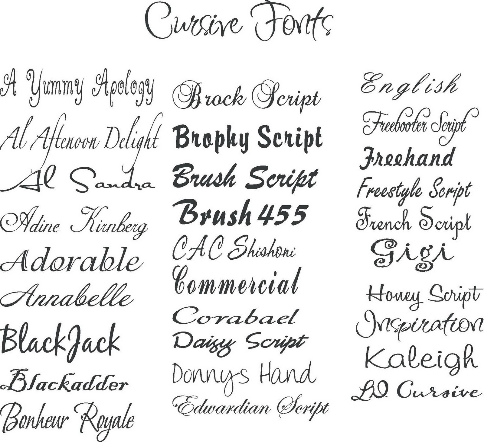
There are five generic font families: `serif`, `sans-serif`, `monospace`, `cursive`, and `fantasy`. These act as broad categories and ensure that text is rendered even if specific fonts are unavailable.
Benefits of Using Different Font Families:
1. Enhanced Brand Identity: Carefully chosen fonts can reinforce brand messaging and create a distinct visual identity. Example: A luxury brand might use a serif font like Playfair Display to convey elegance, while a tech startup might opt for a modern sans-serif like Open Sans.
2. Improved Readability: Different fonts have different characteristics that affect readability. For body text, legible fonts like Georgia or Verdana are preferred. Example: Choosing a font with good x-height and letter spacing can greatly improve reading comfort.
3. Visual Hierarchy: Using different font families for headings, subheadings, and body text creates a clear visual hierarchy, making content easier to scan and understand. Example: Pairing a bold sans-serif heading with a lighter serif body font can create a balanced and engaging layout.
Action Plan:
1. Define your brand personality: What message do you want to convey?
2. Research font pairings: Explore font websites like Google Fonts and FontPair.
3. Test different font combinations: Experiment to find the perfect balance.
Advantages and Disadvantages of Web Fonts
| Advantages | Disadvantages |
|---|---|
| Wider typographic choices | Potential performance impact (page load speed) |
| Enhanced brand identity | Licensing restrictions for some fonts |
| Improved readability | Rendering inconsistencies across different browsers/devices |
Best Practices:
1. Limit the number of font families: Too many fonts can create a cluttered and confusing design.
2. Prioritize readability: Choose fonts that are easy to read, especially for body text.
3. Use web-safe fonts or web font services: Ensure cross-browser compatibility.
4. Optimize font loading: Minimize the impact on page load speed.
5. Test on different devices: Ensure your chosen fonts render correctly.
FAQ:
1. What is a CSS font family? A group of fonts with similar characteristics.
2. How do I specify a font family in CSS? Use the `font-family` property.
3. What are web-safe fonts? Fonts commonly installed on most operating systems.
4. How can I use Google Fonts? Include the font link in your HTML.
5. What are fallback fonts? Backup fonts used if the primary font isn't available.
6. How can I optimize font loading? Use techniques like preloading and subsetting.
7. What is the difference between serif and sans-serif fonts? Serifs have small strokes at the ends of letters; sans-serifs do not.
8. How do I choose the right font for my website? Consider your brand, content, and target audience.
In conclusion, mastering CSS font families is a crucial skill for any web designer. From enhancing brand identity to improving readability, the right typography can significantly impact the user experience. By understanding the nuances of font selection, implementation, and optimization, you can unlock the power of web typography and create websites that are both beautiful and engaging. Take the time to explore different font combinations, test thoroughly, and embrace the art of crafting visually compelling web experiences. Choosing the right font is an investment in your users and your brand. It’s the subtle detail that elevates a good website to a great one, creating a lasting impression and fostering a deeper connection with your audience.
Navigating week 10 ppr quarterback rankings
Wells fargo financial statement deep dive what you need to know
Can azure devops handle waterfall projects


