Conquer Your Pivot Charts: Banishing Blank Rows in Excel
Ever wrestled with a cluttered Excel pivot chart, riddled with unsightly gaps and empty rows? You're not alone. Blank rows can disrupt the flow of your data story, making it harder to glean insights and present information effectively. This guide will empower you to banish those blank rows, transforming your pivot charts into sleek, insightful visuals.
Imagine presenting a sales report with intermittent blank spaces representing missing data for certain regions. The visual impact is weakened, and the audience might struggle to grasp the overall sales trend. Eliminating those blanks creates a cleaner, more cohesive picture, allowing your data to speak volumes.
The problem of blank rows in pivot charts stems from the inherent nature of pivot tables. They summarize data, and if certain categories within your source data lack values for specific criteria, the pivot table will reflect this with blank cells. These blank cells then translate into empty rows in the corresponding pivot chart, creating visual gaps.
The importance of eliminating blank rows lies in enhanced data clarity and a more professional presentation. A chart free of unnecessary gaps is easier to interpret and more visually appealing, improving the overall impact of your data analysis.
This issue primarily arises when the underlying data contains missing values for certain combinations of categories. For instance, if you're analyzing sales data by product and region, and a particular product wasn't sold in a specific region, the pivot table and chart will display a blank row for that region under that product.
One common approach to tackle blank rows involves filtering the underlying data to exclude categories with missing values. This can be achieved using filters in the pivot table itself or by filtering the source data before creating the pivot table.
Another technique involves using the "Show Items with No Data" option in the pivot table field settings. Deselecting this option can prevent the display of categories with missing values, thus eliminating the corresponding blank rows in the chart.
Alternatively, you can use formulas within the source data to replace missing values with zeros or other appropriate placeholders. This approach can be helpful if you want to include all categories in the chart, but don't want the visual gaps caused by blank cells.
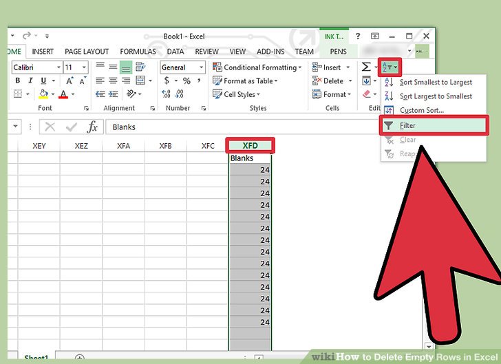
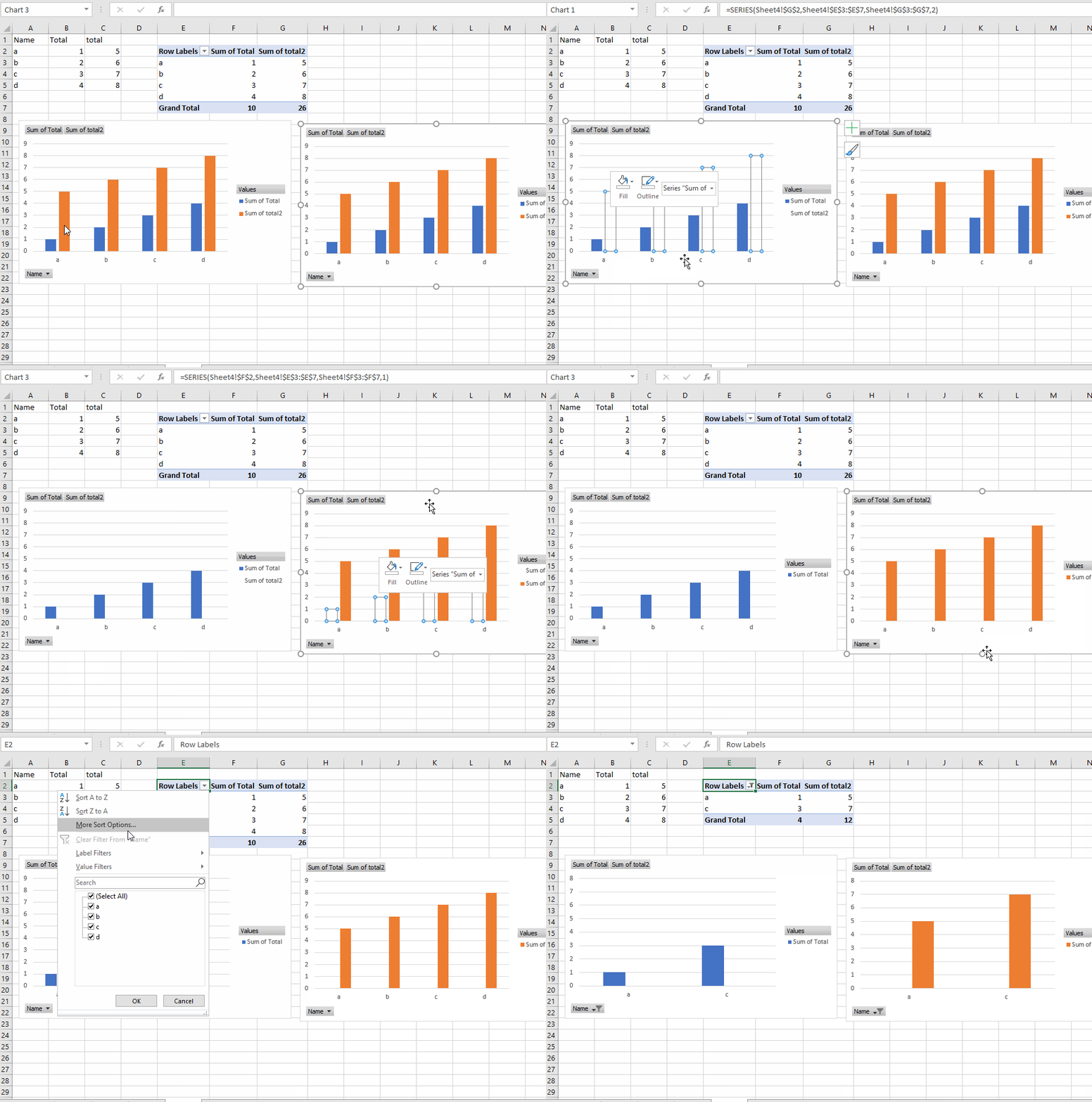
A straightforward approach to remove blank rows is by using filters in the pivot table. Right-click on the field causing the blank rows and select "Filter". Then, deselect the "(blank)" option.
You can also modify the source data to fill blank cells with a value like zero. This can be achieved using the "Find and Replace" feature in Excel, searching for blank cells and replacing them with the desired value.
Advantages and Disadvantages of Removing Blank Rows
| Advantages | Disadvantages |
|---|---|
| Improved Visual Clarity | Potential Data Misrepresentation (if not handled carefully) |
| Enhanced Data Interpretation | Added Complexity (especially with large datasets) |
| More Professional Presentation |
Frequently Asked Questions:
1. Why do blank rows appear in my pivot chart? Blank rows typically arise from missing values in the underlying data.
2. How can I prevent blank rows from appearing? You can filter out categories with missing data or use the "Show Items with No Data" option.
3. Can I replace blank cells with zeros? Yes, you can use formulas or the "Find and Replace" feature to replace blanks with zeros.
4. Will removing blank rows affect my data analysis? It can, so ensure you're not misrepresenting the data by removing relevant categories.
5. What's the best way to handle blank rows? The optimal approach depends on the specific context of your data and analysis goals.
6. Are there any automated tools to remove blank rows? Yes, some Excel add-ins and VBA scripts can automate this process.
7. How do I filter out blank rows using VBA? VBA code can be written to programmatically filter or hide rows with blank cells in the pivot table's source data.
8. Can I conditionally format blank rows? Yes, you can use conditional formatting to highlight or hide blank rows based on specific criteria.
One helpful tip is to create a backup copy of your data before manipulating the pivot table or its source, ensuring you can revert to the original state if needed.
In conclusion, removing blank rows from Excel pivot charts is crucial for creating clean, impactful visualizations. By understanding the underlying causes and employing the appropriate techniques, you can effectively banish those empty spaces and empower your data to tell a compelling story. This enhances the readability and professionalism of your charts, making them more effective for data analysis and presentation. Taking the time to address this seemingly small detail can significantly improve the overall impact of your data insights. Remember to choose the method that best suits your specific data and analytical objectives, always prioritizing data integrity. With a little practice, you can master the art of creating clear and concise pivot charts, allowing your data to shine.
Unleash your inner trainer exploring the world of pokemon fanfiction ocs
The allure of snape as father figure in harry potter fanfiction
Unlocking success decoding form 4 sports science objective questions


