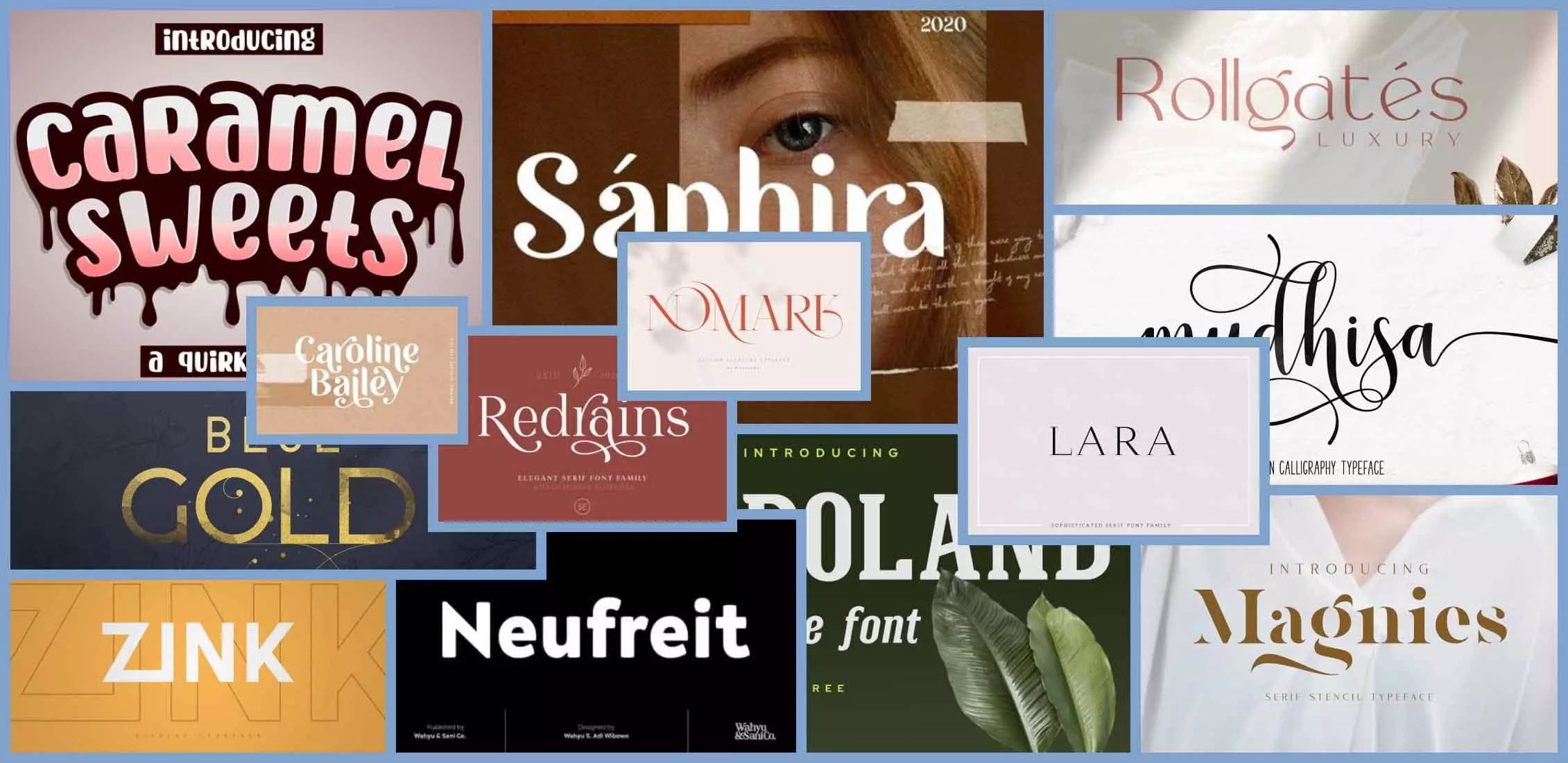
Captivating Your Audience: The Ultimate Guide to the Best Fonts for Presentations
Ever sat through a presentation where the slides were visually jarring, the text difficult to decipher, and the overall message lost in a sea of poorly chosen fonts? The truth is, typography plays a crucial role in effective communication, especially in presentations. Selecting the best font for presentation can be the difference between a captivated audience and a room full of distracted individuals.
Choosing an appropriate typeface is about more than just aesthetics. It directly impacts readability, professionalism, and the overall impression you make. The ideal presentation font should be clear, legible from a distance, and complement your content, not compete with it. This guide delves into the art of selecting the perfect presentation fonts, empowering you to create visually appealing and impactful presentations that resonate with your audience.
While the concept of "best" is somewhat subjective, certain fonts consistently perform well in presentation settings due to their clarity and readability. These fonts have often evolved from traditional print typography, adapting to the demands of digital displays and large-format projections. Understanding the historical context of typography helps inform your font choices, ensuring your presentations reflect both current trends and timeless design principles.
The importance of suitable typography in presentations cannot be overstated. A well-chosen font enhances readability, improves audience engagement, and reinforces your message. Conversely, a poor font choice can distract, confuse, and ultimately undermine the effectiveness of your presentation. Common issues include using overly decorative or stylized fonts that sacrifice clarity, selecting fonts that are too small to be read from the back of the room, or employing inconsistent font usage throughout the presentation.
Think of your presentation font as the voice of your slides. Just as a clear and engaging speaker commands attention, a well-chosen font ensures your message is delivered with impact and clarity. A presentation with effective typography communicates professionalism, attention to detail, and respect for your audience's time. This ultimately contributes to a more engaging and memorable presentation experience.
One simple example is comparing Arial and Times New Roman. Arial, a sans-serif font, offers a clean, modern look, making it ideal for headlines and short bursts of text on slides. Times New Roman, a serif font, is traditionally associated with body text in print, but can appear dense and less legible on projected slides.
Benefit 1: Enhanced Readability. Fonts like Calibri and Helvetica are highly legible, ensuring your audience can easily absorb information, even from a distance.
Benefit 2: Professional Appearance. Using a consistent and appropriate font like Open Sans projects a professional image, enhancing your credibility.
Benefit 3: Improved Engagement. Visually appealing typography keeps your audience focused and engaged, making your message more impactful.Advantages and Disadvantages of Popular Presentation Fonts
| Font | Advantages | Disadvantages |
|---|---|---|
| Arial | Clean, Versatile, Widely Available | Can be Overused, Lacking Personality |
| Helvetica | Modern, Clean, Legible | Can be Expensive (depending on licensing) |
| Open Sans | Friendly, Open Source, Web-Friendly | May not be formal enough for all contexts |
Best Practices:
1. Limit Font Choices: Stick to a maximum of two or three fonts for consistency.
2. Size Matters: Ensure text is large enough to be read from the back of the room.
3. Contrast is Key: Use sufficient contrast between text and background colors.
4. Hierarchy through Size and Weight: Use variations in font size and weight to create visual hierarchy.
5. White Space is Your Friend: Don't overcrowd your slides. Use white space effectively to improve readability.
Frequently Asked Questions:
1. What are the best fonts for presentation headlines? (Answer: Impactful yet readable fonts like Montserrat or Bebas Neue)
2. Should I use serif or sans-serif fonts for presentations? (Answer: Sans-serif fonts are generally preferred for their on-screen readability.)
3. Are decorative fonts suitable for presentations? (Answer: Use sparingly, if at all. Prioritize clarity.)
4. How can I ensure my font is readable from a distance? (Answer: Test your slides on a projector or large screen.)
5. What is the ideal font size for presentation body text? (Answer: At least 24 points.)
6. Where can I find free fonts for presentations? (Answer: Google Fonts, Font Squirrel)
7. How do I embed fonts in my presentation? (Answer: This depends on the presentation software. Consult the software's help documentation.)
8. How can I avoid font conflicts when sharing my presentation? (Answer: Use web-safe fonts or embed the fonts in your presentation file.)
Tips and Tricks: Use font pairings for visual interest, explore font preview tools online, and always test your slides on a projector to ensure readability.
In conclusion, selecting the optimal font for your presentation is a crucial step in creating a compelling and effective presentation. From enhancing readability and professionalism to boosting audience engagement, the right font can significantly impact how your message is received. By considering factors like legibility, audience, and context, and by following best practices and exploring the vast array of font options available, you can elevate your presentations from ordinary to extraordinary. Take the time to choose wisely – your audience will thank you for it. Start experimenting with different fonts today, and discover the power of effective typography in transforming your presentations into captivating visual experiences. Don't underestimate the impact of this seemingly small detail. The right font can make all the difference in conveying your message clearly, engaging your audience, and achieving your presentation goals. Invest in the time to choose wisely, and you’ll reap the rewards of a more impactful and memorable presentation.
Unlocking the fun a guide to super animal royale items
Conan exiles attributes build
Dominate your league fantasy football defense rankings week 8


